Friday, 19 March 2010

2nd Draft Magazine


From here, I need to change my image as it is too cluttered for a magazine. I initially decided to use this image as I want my magazine to be niche. However, due to feedback, I am going to change the image and also expand on the puffs around my central image.

First Draft Article

It’s the 24th March 2010, and as Gee points out, the 5th anniversary of her band ‘Penguin Playsuit’ formation. After bursting onto our scenes two years ago with the catchy yet increasingly annoying ‘The adventures of Robin Hoodie’ –she sits shaking her head at the mention of this title, slightly cringing.
‘I got sick to death of ‘Robin Hoodie’, I hate the way it sounds, I hate the music the band used to make, and I hated it all’
Selfish you may think seeing as our love of their self titled debut album ‘Penguin Playsuit' won them the Best New Band Award at the NME Awards last year and got them nominated for Best Single at the Brits. They also featured on BBC’s Sound of the Year in 2008, so what is Gee's problem?
‘The music was naive, I was 19 at the time, I thought I was a poet, the next Sylvia Plath or whatever, I also enjoyed the synth keyboard a bit too much.’
Throwing her head back laughing, you can see why the British public has embraced this young artist. She was even voted Young Style Icon of the year and topped a poll of best hair.

However, this protégé of music is venturing from the safety of her band and has decided to release a solo album to ‘see how it goes’.
The grade 7 pianist and violinist studied English Literature at Exeter University where she met most of her band. Luckily for her, one of the band members had close links to a man who would later go on and produce ‘Penguin Playsuit’
‘It was odd to think my friend knew Rostam Batmanglij’
Rostam is the producer of Vampire Weekends two albums and also a guitarist in the band –
‘But they were distantly related of something so we made contact with him after about a year’s practise; we didn’t think it would go well at all’

However, her solo album is being produced by the up and coming Starsmith, the mastermind behind Ellie Gouldings ‘Lights’
‘Although I loved working with Rostam I wanted to release this with fresh blood, I want a new take on my music’

But if you think the line of award winning people wanting to work with Gee or Penguin Playsuit stops there, think again. Production monsters Hammer and Tongs made the ‘The Adventures of Robin Hoodie’ video after being impressed by the bands talent –
‘I wanted to work with them as soon as Polydor contacted me’ says Garth Jennings, one half of the company, ‘I heard of them as we created Vampire Weekends ‘A-punk’ as Rostam [Batmanglij] was working with them’

Gee has decided to work with Kinga Burza, director of Kate Nash’s ‘Foundations’ and Katy Perry’s ‘I Kissed a Girl’. Saying again that she wanted a fresh start from the band, it seems she has distanced herself from the band and all the people she worked with -
‘Not at all, I appreciate all the help I got but I don’t want to be accused of being a one trick pony, I want to prove I can be different.’
It seems that a changing image is important to this artist, much to the distaste of Elly Jackson, lead vocalist and front woman of La Roux.
‘I don’t have a clue what her problem is, where it came from or why she hates me or the band’
Elly and Gee were spotted arguing at the recent NME due to Jacksons backhanded comments:
‘I mean at least we’ve won awards’
La Roux won an NME Award for Best Dancefloor Filler this year; however it was for the Skream Remix of the song.

So what’s in store for this young artist?
‘Well me and the band are going on tour – we’re the support act for...The Arctic Monkeys – I can hardly believe it. They haven’t toured in ages either.

And her biggest ambition?
‘I want the band to be as legendary as The Smiths, but I wanna be Debbie Harris meets Cheryl Cole but cooler. Much Cooler.’

Possible Photos

Thursday, 4 March 2010

Magazine Plan (2)

Cover page


Contents page


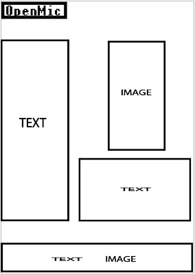
To ensure that my magazine looks as good as possible I will redraft as many times as possible. For now I have a very basic layout for my magazine, however I hope to evolve this as my ideas and creation developes.


Sunday, 28 February 2010

Q Article Analysis

The chosen artist that features in the Q article is Cheryl Cole, this is due to her recent solo work as Girls Aloud have taken a years break. The choice of artist is odd for Q magazine which is renowned for featuring 'serious' artists such as The Killers, Green Day, U2 and Muse, also most of the cover artists fall into the rock genre. However, when women feature on the cover of Q, their image is sexualized, such as Lady Gaga's and Lily Allen's topless cover pages, possibly due to the fact that the main target audience is men above 25. They also fall into the pop genre, so Cheryl Cole being on the cover and having the main article is not so strange after all.
The language in the article gives the reader the sense that Q believes them to be intelligent and well informed. They use wordy phrases such as 'So universal has Cole's appeal become her individual achievements have eclipsed those of Girls Aloud', showing that they are not minimizing the amount of words to appeal to a wider audience, they want older people to be entertained by the article. There are also some obscure words that younger people might not understand such as 'nadir' demonstrating Q's aim of appealing to adults. However as it is a magazine, and not a serious broadsheet newspaper, Q uses quotes from Cheryl Cole and other people who know her to give the article a more welcoming feel. The anchorage text to one of Coles images is 'Everything I do is scrutinized. Everything I fucking say'. Q wants our attention to be brought to this phrase as it is dominant on the page; even if you didn't read the article and just skimmed through you would still see this. This is because they want the article to feel as if it is between two friends, the formality is reduced with the use of the swear, also Q knows its main readership is adults so there is no need to worry that they will offend someone with it.
The text in the article is a simple black font, this gives a sophisticated feeling to the magazine as it follows the house style of Q, the anchorage text is in red demonstrating the importance of the house style. The article is laid out around various pictures, giving it a simple feel and sticking to the fact that they aim to look sophisticated. However, most of the article is made up of images, on the pages of texts the image is the main attraction on the page. Also three out of the six pages in the article is dedicated solely to images rather than text, this could be due to Cheryls fame as one of the most attractive people in Britain and Q is playing to her strengths.
The images in the article present Cole in an attractive manner, she has pouted poses and leather clothing showing her in a sexual light, her images also have connotations to the film Sin City, something that the readership will be able to relate to. The text attached to one of her images reads 'Wa-hey, I shoulda brought me brolly pet', which is the antithesis of what is being shown in the image. Q may want the reader to not take the article too seriously as the images suggests you would, it may also be Cheryl Cole showing that she too doesn't take herself seriously either as she jokes about the Prime Minister Gordon Brown too, 'Brrrr' She grimaces 'Slippery one ain't he?'.
The article does demand some prior knowledge about Cheryl Coles career, however, this is common knowledge to anyone who hasn't been living under a rock for the past few years. Again, like the NME article, anything that happened prior to the article is explained just in case. However, in Q it is not explained in a large amount of detail so that it doesn't patronize the adult readers.

Friday, 26 February 2010

NME Article Analysis

The chosen artist that features in the NME article is Gerard Way, lead singer of the band My Chemical Romance. The bands recent album (released four years ago) The Black Parade was aimed at those who felt misunderstood or alienated by society, mainly teenagers. This suggests that the magazine is too aimed at teenagers as they would be interested in reading about teenager’s main rock icon.
The language used in the article is mainly simple, it’s wrote in a formal fashion but is laced with colloquial phrases such as ‘chucked out their tunics’ and ‘honk the pop fact sirens’. This is because the article is informing the reader about the years that My Chemical Romance have been missing from the music scene but they aim to do it in a way that will keep the reader interested, teenagers don’t want the intelligence level of the writing to be too high because they will get bored or confused and opt to read another magazine.
The tone of the article gives the sense that NME wants the reader to feel like the member of the in-crowd, they are parting information about something that has not yet been released yet. They also want the reader to feel as if they were a close friend; this is demonstrated through colloquial phrases and social words such as ‘Riiiiiiiiight’. However they treat the reader as if they were an informed fan as they talk about tracks from other artists albums like ‘Jenny was a friend of mine’ by the Killers. But the chances of an NME reader actually reading this article is slim as the artist may not appeal to all of them and they may not have the attention span to read such a lengthy article. The text used is a simple black font, which follows the house style of the magazine. There are also few entry points within the article; it seems that you would have to read the whole article to understand what is going on. The article is spread over four pages, the readership just won’t have time to read this amount.
The majority of the article is text rather than images; this is odd for NME as their readership is mostly interested in looking at montages of images rather than reading lengthy articles. The images show Gerard Way now and back on The Black Parade tour, this is to highlight to the readers that the band has changed from what it used to be. This could be a ploy to entice teenagers who didn’t like My Chemical Romance before to give them another chance because they are different now.
The main image for the article is a close up of Gerard Way with the anchored text of ‘This record is going to be a grand failure if people don’t get it’, this is juxtaposed with the image as from the facial expression Gerard Way seems to not care if his music fails, the text however suggests otherwise.
The article seems to only make sense if you were aware of My Chemical Romances previous album and image. Newer readers of the magazine who would’ve been too young to know about the album which was released four years ago might struggle to understand the concept of change within the band. However NME explains the previous album and tour, the rock opera about a cancer patient and the controversy surrounding it, helping recent readers to understand the history of the band.

Friday, 5 February 2010

Contents Analysis, NME


The contents page for NME is dominated by a large picture of Blur. This is because they recently reformed for summer shows and this was the first time since then that the band has been pictured together. This confirms that the magazine is aimed at young males; the page is dominated by a picture rather than an article. The other image on the page, which is small and in the corner, is a snapshot of January’s edition of NME. Seeing as NME focus on gossip rather than content, the fact that Blur are the main image shows that they are the biggest gossip for that month’s issue. Also, as the members do not have a direct mode of address, the magazine seems more laid back; this suits the target audience who are mainly teenagers who share this ethos.
The colours and fonts used follow the conventions of the front colour. The contents page follows the house style of the magazine, with the text being the same as the title block. This creates a more stylish magazine, if the fonts and colours repeatedly changed then the magazine would look trashy.
The information in the magazine is organised in alphabetical order of artists. Unlike other magazines that have the name of their articles on the contents page, NME tells you the page where you can find the artist. This helps the reader to access the artists that they are interested in; it gives the target audience freedom to decide what they want to read. This tells the audience that the magazine has gone back to basics to make the reader feel like they can easily access the articles in the magazine.
The contents page also contains the promotional offer of getting the magazine for 85p per issue if you subscribe. This makes the target audience feel like they are getting a good deal, as it is aimed at young males who don’t have a large disposable income, also NME are guaranteed to sell copies each week.
The magazine logo appears up in the corner of the contents page. As it is a small image, this shows that the magazine wants to portray that the artists are more important than their brand. The promotional offer also contains ‘NME’ in bold, this is the only time that the magazine title has dominance on the page.