Sunday, 31 January 2010

NME Cover Analysis

NME is a music magazine aimed at 15-24 year olds, particulary young males who enjoy seeing their favourite bands at various venues and festivals. The magazine consists of montages of pictures rather than in-depth articles due to their readership. It sees its self as more as a newspaper than a magazine, as the title suggests, and reports on the latest gossip in the music world.
The title block tells us that the magazine is attempting to attract the youth with its bold lettering, the pointed 'M' also suggests that the magazine is 'cutting edge' and can offer new music to its young readers. The colours are also very bold which is something that the readership seeks as they search for who they really are. The title is also pronounced 'Enemy' which connotes the readership attempting to 'stick it to the man', it also suggests that the magazines enemy is popular culture, with this being the same enemy as the readership.
From the front cover, the magazine covers the latest news in music, there are puffs that read "Jay Reatard RIP" and "Courtney and Keef, Worst Duet Ever?", this tells the readership and potential readers that the magazine will cover the general news of the music world, particulary the indie genre. The puffs also suggest that the readership will know about indie music and non-mainstream music, you wouldn't expect a fan of The Saturdays to read this magazine.
They also use the buzz word 'Plus' to give the readership the sense that they are getting more content for their money.
The central image is of Gerrard Way from My Chemical Romance, NME wants us to feel like we have a relationship with him due having a direct mode of address. However, his body is twisted away from the camera and only half of his face is on view, this suggests that NME wants to create an element of mystery around Gerrard Way, they want us to know him but not the whole of him.
Gerrard is on the front cover due to the upcoming release of My Chemical Romance's new album. NME can take advantage of the huge fanbase of the band who will buy this new issue simply because Gerrard Way is on the cover. NME can also draw in a bigger readership as Gerrard is talking about their new album; My Chemical Romance have'nt released an album since 'The Black Parade' went platinum in 2006.
The anchorage text attached to the image suggests to the reader that My Chemical Romance have rebranded themselves. The text reads "My Chemical Romance, On Their Punk Comeback Album", this tells the reader that the band has developed since their last album. Also by having the quote from Gerrard Way attached the readership will feel like Gerrard Way is telling them directly about the bands new image and sound.
The overall image being portrayed by the artist is an uncaring one, it seems that the artist doesn't care whether we like him or not. Also there is an element of mystery surrounding Gerrard Way as his mode of address makes the audience feel as if he is hiding something.
The magazine follows a red, white and black colour theme with the title block following suit. This gives the reader the idea of mystery and danger, something that Gerrard Way also wants to demonstrate. Also if they used more than three colours the magazine could look trashy, this is something that NME wants to avoid as it would be off putting to its readership.
NME attempts to attract readers by mentioning numerous bands and artists on the front cover, the audience gets the sense that they will be getting more for their money. They also feature less known artists that dont really get coverage in other music magazines, so they appeal to a niche market. This issue also has new Gorillaz art and interview with them being a very popular band.

Thursday, 21 January 2010

Block Title Analysis

  • Target Audience: Males, 15 -24, although their main readership is in the category 15-44 the chances of someone over the age of 30 reading Kerrang! is slim. This due to the font, colour and connotations that the magazine title carries.
    The word 'Kerrang!' is onomatopoeic, it is supposed to sound like the voilent strumming of a guitar; this suggests the genre of the magazine which is rock music.
    Font: Distorted edges connoting urban and industrial living - the readers are 'rough round the edges' and have a more edgy look to them.
  • Capital Letters - Attracts the readership through its boldness; directly related to the world being onomatopoeic, helps us visualise the guitar noise
    Colour: The black fits in with the readership as it follows the stereotypical view of their readers being 'emo's' and 'goths'
  • The word looks as if it has been smashed; this connotes the recklessness of the readership and their lack of fear of authorities
  • The 'A' doesnt follow the convention of the alphabet, as they chose to fill the letter 'A', this could be seen as a form of anarchy and is the magazines subtle way of 'sticking it to the man', something their readership can reflect on.

  • Target Audience: Males, 15-24, although with this magazine it is more likely that the readership could be older than 24 than it is for Kerrang!
  • NME stands for 'New Musical Express' this reflects the young readership who are discovering who they are and what type of music they like, the magazine offers self discovery.
  • Font: Bold Lettering - Attracting the youth, being bold and reflecting teenagers want of being 'different'. The pointed bottom of the 'M' connotes the magazine being cutting edge and offering new music to its young readers
  • Colours - The red, white and black connote boldness; something the readership searches for seeing as the magazine showcases indie music
  • The readership probably spends their time seeing various bands in different venues.
  • Heat magazine of the music world- heavily features gossip from the music world
  • Prounounced 'Enemy' - again 'sticking it to the man' its enemy is popular culture, the same enemy as its readership.


  • Target Audience: Males, 24-44, Mojo which means 'talent' appeals to the adult audience because it reports on all types of music.
  • Mojo- connotes a type of power, directly related to the 70's when people started to express themselves and free themselves from various rules by experimenting with sex,drugs and music.
  • Black and white colour theme connotes simplicity; something that the readership used to enjoy before we entered the 'pace age'. The font is also very simple too, again connoting the same ideology.
  • The shadowing effect behind the lettering gives the readership the idea of night-time and going out and having fun.
  • Classic rock, in-depth coverage of classic and cult acts - suited for the readership that looks for more of an article than a collage of pictures.

  • Target Audience: Males, 24-44, (woman are aimed too), readership is older due to the fact the features are more in-depth, also the artists are 'serious' ones, acts such as McFly and Busted wouldnt feature
  • The single lettered title is prominent on the news stands, seeing as other magazines have whole word titles
  • Colours: Red and white - background of red connotes power and danger, with it standing out in the music stand and the white demonstrates how pretigious the magazine is. This is heightened by the fact that the rating Q gives a magazine features on the artists advertising campaign. Also the read and white would appeal to the English readership as these are the colours of the national flag.
  • The 'Q' leans slightly to the left; this shows that the magazine not only covers mainstream acts but also 'left-field' acts that don't usually get coverage in the main news press.
  • The shadowing effect connotes how Q's readership follows them; we trust in the magazine.

Analysing Magazine Covers


Q is a music magazine aimed at 24-44 males, this is due to the in-depth articles that feature in the magazine, also the artists that feature are the “serious” ones; this is not a magazine that covers the likes of McFly. The target audience would be interested in a wide range of music; they would also be interested in reading thorough articles on these acts.
The single lettered title is prominent on the newsstands, seeing as other magazines have a whole word title, this tells us that the magazine will feature only the acts that ‘stand out’. The ‘Q’ leans slightly to the left; this shows that the magazine not only covers mainstream acts but also the ‘left-field’ acts that don’t usually get coverage in the main news press. Also the shadowing effect connotes how Q’s readership follows them; we trust what we read in the magazine.
From the front cover, we can see by the puffs that the magazine will consist of articles on a range of acts; from Vampire Weekend to 50 Cent. It also consists of features on new artists as the puff reads ‘The 10 Best New Acts’ but also well established artists such as U2 and Biffy Clyro. The buzz word ‘Best’ makes the readership believe that Q magazine will only feature the most prestigious of artists, we also feel that they want us to have the best; they are giving us value for money.
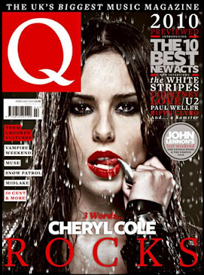
The anchorage text attached to the central image of Cheryl Cole tells the readership that the main feature in the magazine will be on her.
The central image of Cheryl Cole has a direct mode of address; Q wants the reader to feel as if they have a relationship with her, they want the reader to feel attached to the Cheryl and therefore feel as if they have to buy the magazine. Cheryl is on the cover due to the fact that she has recently released her first solo album, she needs to promote her singles and albums for them to be successful. Also as Q is aimed at males, Cheryl Cole makes an attractive draw for readers seeing as she was voted number one in FHM’s top 100 sexiest females in 2009.
The anchorage text attached to her reads “3 Words ... Cheryl Cole, Rocks”, this is an intertextual reference to her album that is titled ‘3 Words’. Also the magazine is trying to detach Cheryl from her pop image; as she is in the girl band Girls Aloud she may not appeal to the readership on their musical credibility. However, by the edgy central image and saying that she ‘rocks’, the readership may start to believe that she has left her pop days behind her.
From the image, we get the idea that Cheryl is conveying the message that she is not only ‘sexy’ but also edgy. The image has an intertextual reference to the film ‘Sin City’, this is a film that Qs readers should be familiar with, and this ensures that the reader will not be alienated by the magazine and by the fact that a pop artist is featuring. The red lipstick connotes sexuality to the readership; this is due to the fact that it is predominantly by males. However, female readers may see the lipstick as connoting power, as we typically attribute this to business types when it’s combined with black clothing. This is also combined with the pointed ring that looks like a claw; for females again this would connote power; however the ring caters for the male readership as she is licking the tip in a seductive way.
From this front cover, females are being represented in a stereotypical way, no matter what magazine a female features on they are always shown in a seductive or attractive manner. This also stereotypes the readership as the magazine is showing us what we stereotypically want to see; males want a sexy image and females want to see someone that we can aspire to.
The Colours of the magazine follow a black, white and red theme; this is due to the reference to Sin City which also follows this theme. Also it ties in directly with Cheryl’s new ‘rock’ image and Q’s prestigious style. The colours and central image creates a dark atmosphere, but also a very ‘cool’ one, the imagery makes the readers aspire to be like Cheryl as she sheds her former image for this photo shoot. The Block title is also in red and white; the background of red connotes power and danger, with its standing out in the music stand and the white demonstrates how it is a prestigious magazine. This is heightened by the fact that the rating Q gives an artist features on their advertising campaign. Also the red and white would appeal to the English readership as they are the colours of their national flag.
The Slogan for the magazine reads ‘The UK’s Biggest Music Magazine’, this shows Q’s self confidence that it is the best magazine for music in the UK. It also gives the readership the sense that everyone will be catered for; if it is the biggest then it has to feature a wide range of artists from various genres, this is something that Q manages to do.
The fonts used on the magazine as simple, blocked ones. This makes the magazine easy to read at first glance, this ensures that they entice a broad readership as the font appeals to everybody.
The magazine attempts to attract the audience by mentioning a wide range of artists in the puffs, the audience are more likely to spot an artist they like in the long list. They also make the audience feel that they will be ahead of everyone else in the music world as they reveal the best acts of 2010, even before the year has fully started.

Sunday, 11 October 2009

Future Publishing

Future Publishing creates a wide range of magazines from gaming to music magazines. In their music magazine section they publish a total of 11 magazines, eight of which being specialist magazines for those who know how to play or are learning how to play an instrument. These eight magazines include Total Guitar, Rhythm, Computer Music, Hi-Fi Choice amongst others, and are all about perfecting performances, techniques and becoming the best musician you possibly can.
Classic Rock, MetalHammer and Classic Rock Presents Prog are all about already famous musicians or bands, Classic Rock goes behind the scenes and is the 'voice of rock journalism', MetalHammer covers hard metal rock bands and features a comprehensive news section, and Prog covers bands creating progressive rock. There is a clear link between Classic Rock and Classic Rock Presents Prog as the second magazine features Classic Rock in its title.
The specialist magazines are linked as there is a choice of what magazine you read for your instrument, this is highly attractive to advertisers as there is a multiple choice of magazines for one topic so they can place there advert across many magazines whilst only having to deal with one publisher. Eg. There are three magazines for Guitars
Also the instruments that the specialist magazines cover could be put together in a band, unknown bands could buy a selection of Future Publishing's magazines and everyone would have something to read.
Furture Publishing can also promote their other products in their magazines, this is like how they could promote their events in the corresponding magazine:
  • In MetalHammer they can advertise for MetalHammer Tours
  • In Classic Rock they can advertise for Classic Rock Roll of Honour

Also many of their magazines have an accompanying website so this could feature in their magazines and vice versa. There may also be readers of Total Guitar who might be interested in buying Guitarist, or readers of Computer Music interested in reading Computer Music Specials etc. so Future Publications can adverise many of their magazines in ther other magazines, during their events and on their websites.

Wednesday, 7 October 2009

Magazine Covers

On magazines the Editors main concern is what is on the cover. This is because the cover sells the magazine to the public, tells us what the magazine is about and it creates a brand image for the magazine; when we walk into a shop we can easily identify the magazine.

The Editor of Kerrang! appeals to the whole of its readership by including different sub-genres of rock, from indie to punk, this ensures everyone has something to read. As Kerrang! is generally read by teenagers , its main sell points are the free things they give away eg stickers, posters, calenders, exclusive interviews with favourite famous bands or musicians and the chance to turn a magazine into a collectors item eg. collect all five My Chemical Romance Covers, one member on each cover.

Sometimes Kerrang! features a CD, this is desirable to the general public and boosts sales up about 40,000, most of which are casual readers, the Editor then has to ensure that the magazine can keep the new readers. Mixmag magazine has a CD mounted cover each issue, however this pushes up costs of production which is passed on to the consumer, and also a huge amount of employees and work time so the CD is not low quality.

On a front cover of a magazine, the most important parts are the logo (title) and the sweetspot as this is where our eyes are drawn to first, they confirm the brand image and sell the magazine to us. Magazines have to be reassuring but different on each of their covers so the readership can identify it and also not get bored by repetition.

Publisher Research


Bauer
Bauer Company produces 282 titles ranging from both niche and mainstream, as it is a big company the target audience is quite general and they provide for everyone.
Some of the mainstream titles include:
· Heat FHM
· Grazia Closer
· Kerrang! Q

They also provide for the niche market and have a wide range of magazines to choose from:
· Modern Rail Pregnancy and Birth
· Angling Times Bird Watching
· Classic Cars Practical Photography

Also within each subset of the magazine world, whether that is fishing or music, Bauer has a wide range of titles, all of which are aimed at adults.
They also provide media on other platforms including local and mainstream radio like Northsound Radio and Kiss FM, channels like 4Music and The Box and they own the charity Cash For Kids.
Based on the magazines that they publish and the other media platforms, it seems that the brand image of Bauer is a musical one. Although they publish a wide range of magazines, the amount of radio stations and music channels they own is substantial. It also seems that Bauer aims to provide for the niche market as the amount of this type of magazine outweighs the mainstream titles.


IPC Media
IPC Media produces a range of 80 magazines falling both in the niche and mainstream category. Over 26 million adults read an IPC magazine, the mainstream magazines include:
·Look
·Marie Claire
·Nuts

They also produce a large amount of niche magazines, more so than the mainstream ones, including:
·Ships Monthly House
·Railway Magazine
·Motor Caravan

IPC are committed to making their magazines the best so do not operate on other media platforms. Most of the magazines produced by IPC are niche, ranging from transport to good housekeeping. The mainstream magazines produced are wide ranging, this varies from women’s weeklies to men’s entertainment magazines.


BBC Magazines
BBC produce many magazines, most of which are based on their shows or feature an element from their TV programmes. Most of these magazines are aimed at adults, preschool and pre teens, the adult titles include:
· Countryfile
· Wildlife Magazine
· Radio Times

The preschool and preteen magazines include:
·Doctor Who Adventures
·Charlie and Lola
· Teletubbies

The BBC offers media at other platforms as well, from TV to Radio, this influences and features heavily in their magazines. The brand image we get from these magazines is that the BBC wants to educate and entertain us by making magazines that go along side the shows, providing for the diehard fans of their programmes.


Development Hell
Development Hell is an independent media company that produces two monthly niche magazines.
· Mixmag
· The Word

Both of these magazines are music magazines aimed at adults, because of this Development Hell acquired Dontstayin.com, a social networking site for clubbing. This accompanies Mixmag as it is a club and dance magazine; here Development Hell is providing its readership with the things they love, club and dance, on another media platform.
The brand image is of a small company focused on providing niche music magazines that can be the best possible as they only provide two magazines. Also they may also only be able to provide two magazines as Mixmag is CD mounted each issue which is extremely expensive, they may not have the funds to provide more magazines.

Monday, 21 September 2009

The Changing Face of Jennifer Lopez

InStyle Magazine
Jennifer is truly a dominant force, her image covers part of the title showing that she is important, even more so than the magazine itself. The fact that she is wearing a black and white dress whilst she is wearing red lipstick conveys the image of power and high social status. However, Jennifer is standing side on with one hand on her hip, showing her in a more softer way than if she was standing face on to the camera. She is also showing off her figure and the detail of the dress, highlighting that this is a high end fashion magazine. Her hairstyle even conveys dominance and power, it is pulled off her face and seems tight and uncomfortable, a hairstyle usually associated with business women. Although Jennifer looks friendly here, she is also showing that she is a force to be reckoned with and should'nt be written off.
The text on the magazine is all about fashion, this is why the anchorage text for the image is small and in the corner; the article on Jennifer is not about fashion or products. The text also follows the red, white and black theme as too many colours make a magazine look trashy, this is exactly what InStyle wants to avoid.


Cosmopolitan
Again, the image of Jennifer covers part of the title. However, this time she covers quite a large section of the title, it's as if Cosmo is showing off, you don't need to see all of the title but you still know what the magazine is called.
This image focuses on Jennifer having a fiery attitude, she is wearing a long low cut red dress, with red being a sexy colour here. She is face on to the camera in a dominant manner, unlike InStyle her power is sexuality here. This is heightened by her sultry look and her hair flowing everywhere, showing she has a 'wild side' that has been tamed.
The colour scheme is red, orange and yellow, with the text, background and dress all conforming to this theme. these colours have been chosen to portray the image of 'Latino Heat', attitude and sexiness are important to this magazine as women aspire to be like the cover woman.
The anchorage text to her image is again small, this is so your attention is brought to the other headlines which mainly focus on sex. As your attention is brought to her image and these headlines you instantly combine the two and think of Jennifer Lopez as sexy.


FHM
Jennifer's image covers part of the title again, but this time it is only a very small section, now she is only slightly more important than the magazine.
In the image she is wearing a small bikini in a pale blue, it's almost as if it isn't there which is very appealing to the male audience, she is a sex symbol now, the photo is taken on sand against a clear blue background, she is in most peoples idyllic place with her being the ideal woman. The anchorage text also reads 'Goddess', Jennifer is the 'tanned beach goddess' that men wish they could take or meet on holiday.
Jennifer is on her knees in this image, putting her in a less powerful position than if she was standing face on. Having her hand on her hip emphasises her curves, sort of highlighting them and by her leaning to the side she looks more curvy and shows off her flat stomach. Her face in the image is pouty and seductive, it is as if she knows that she is a sex icon and is confident with this image.
Right next to Jennifers head is the headline 'Sex Mad' for another article, instantly it seems as if Jennifer herself is thinking that she is 'sex mad'. The image seems degrading as she no longer seems 'sexy' but she is now a sex icon or symbol making her seem like an object rather than human. But I can see how this image would be appealing to men as they are not aspiring to be like the women on the cover but to have them.


People
The image of Jennifer Lopez evolves into a mature acclimatised one on this cover, the days of FHM or Cosmo seems far behind as she settles into motherhood.
The dress chosen is in a neutral colour, brown, so that the focus of the image is on her babies, as they mean everything to her now. The silk shows sophistication and that fact that it is browny-gold shows her maturity.
The big smile and slightly tilted head gives us a friendly impression, this is heightened by the fact that she is holding babies - she is giving us a motherly welcome. The settee she is sitting on makes us feel as she has invited us round for a 'chit-chat', the whole setting looks comfortable and inviting.
The colours used are warm and all compliment each other. The magazine title is in purple, which blends in with the colour scheme rather than being harsh and standing out. Jennifer looks bright, almost as if she is giving off a 'motherly glow'. This brings all our attention to her, also the text on the magazine is all about her and her babies (apart from a small image and headline at the top), there is no distraction from Jennifer Lopez.


Jennifer has changed from a sex symbol to a sophisticated mother in the space of a few years. These magazines have portrayed her image in such a way so that we can see how she evolves into what seems like a different woman in each magazine.