In creating my music magazine ‘OpenMic’, I attempted to conform to various conventions of music magazines but to also challenge them so that my magazine would stand out if it was in a shop.
My front cover is conventional to other music magazines, my central image features a girl with a direct mode of address, but I decided to opt for a more interesting pose. After having a typical central image of my cover girl taking a feminine stance with a hand on her hip, I decided to change it after receiving feedback. The new central image features Gee with a direct mode of address; however she has put her hands in a square over her eye as I wanted an image more unconventional and interesting as the feedback I received made me consider my target audience more. Also, the image goes with the anchorage text ‘How Gee sees it’ and ‘started making music outside of the box’. The front cover also features various puffs framing the central image, again a convention of magazines. I also included the buzz words ‘Stickers Inside!’ to attract my audience as the results from my questionnaire revealed that my target audience responded to freebies in magazines, it is also typical for music magazines to give away free stickers and posters. I followed these conventions for the front cover as I wanted to follow a formula that is proven to work, I also didn’t want to alienate anyone in my target audience by making the cover too unconventional.
However, I challenged other conventions of music magazines by featuring a female artist who hasn’t been sexualised to suit the male audience, just as Q did for their Lily Allen and Lady Gaga covers. My magazines target audience is females, this was to challenge the convention of music magazines being mainly aimed at males, and this is why the predominant colour on the cover is pink. I made an unconventional contents page as the magazine covers indie music so I wanted to reflect this by making an individual contents that features a dominant image of my cover girl. My article focuses on the musical achievements of the star rather than gossip, something that a magazine like NME is guilty of, although I lightly feature some ‘gossip’ towards the end to show Gee’s ‘normal’ side.
I also attempted to develop other music magazine conventions such as using Photoshop to ‘touch up’ my images to improve my magazines overall standard.
My magazine is aimed at teenage girls who listen to indie music, I represented them in a positive light in the magazine as if I didn’t they would feel insulted and discontinue reading it. My feature article contains a higher level of vocabulary than what you see in other teen girl magazines, this is because I wanted to reflect the intelligence of my target audience, like how I have Gee attend Exeter University and learn various instruments. This was because I wanted to convey the message that you have to work hard to achieve big things, just as Gee does in the article. My magazine can be seen as aimed at more intelligent people, possibly that of a higher social class due to the articles content, however music and aspirations are enjoyed by every social class and contrary to popular belief there are intelligent people in the lower and working classes. To offer a sense of belonging to my target audience, I tried to convey a fun image within my magazine. My feature article focuses on how Gee loves what she is doing; she is also down to earth and can’t believe her luck. I also have Gee in a variety of poses with different props, such as the image where she has two penguins ‘kissing’, this was to help convey her fun side and show that the article was light-hearted. Also, the main image on my 3rd and 4th pages is in a photo-booth style, this is because I looked at various peoples images on Facebooks and saw that this type of image was popular with my target audience. My contents page shows all the artists that features in the magazine, my target audience would feel like they belong as they are all artist from the sub-genre of indie music.
The target audience for my magazine is teenage girls between the ages of 16-24 because there are no music magazines aimed particularly at females. I wanted my magazine to be a rival to NME as this is aimed at males and covers the same type of music, however I aimed to make my articles similar to one that would feature in Q. I would like my magazine to be sold as nationwide as possible as there are people from my social group all over the country. However, I would focus marketing the magazine at the major cities such as London, Exeter, Manchester etc as I feature coverage of gigs and festivals, something that someone in a small town might not have access to.
I attracted my target audience by following what they told me in the questionnaires, like giving away freebies and featuring both established and upcoming artists. To address my target audience I featured a female on the cover and conveyed a strong independent image of her throughout the magazine. To keep hold of my audience I will constantly feature freebies such as posters and stickers and also give away a free CD after the major festivals.
I would like to have IPC to distribute my magazine; this is because their magazines mostly fall into the niche market rather than the mainstream – just like my magazine. I decided that IPC would be better than a company such as Development Hell as my magazine is not niche enough for such a small company and is fortnightly rather than monthly. I chose IPC due to the magazines that they make, such as NME, as I want my magazine to be marketed in a similar way. IPC also produce many other niche magazines such as ‘Uncut’ and ‘Rugby World’, so I feel that they would be the best company to distribute my magazine. NME has evolved over the years from just being a magazine, now there is a radio station, music channel, website, award ceremony and also NME stages at various large festivals, this is something that I aspire my magazine to achieve.
Since beginning my music magazine I have learnt a lot about the technologies within the industry. I found taking the images easier than others as I own a 12 megapixel camera which produces quite a high quality picture, however composing the images and getting things like lighting and costume correct was more of a challenge. I also learned how to use Photoshop successfully, it became easier to use once I had learnt the basics. It also showed to me how I could drastically improve alright images to make them suitable for my magazine. I learned how to change my images completely by using cropping, highlights, shadows, glow, contrasting, changing the curves amongst others. To improve my images I also used the magic eraser, magic lasso and refined the edges to take the image and put it on a better background. I learned that the cover was the most important part of the magazine according to the editor of Kerrang! In an interview we watched, this made me realise that I had to get a better grasp of the technologies in constructing the magazine. I also learned about how blogging can add an interactive element to learning and production. From using Blogger, I easily received feedback from classmates and my teacher; it also allowed me to see the quality of work produced by my classmates. This then allowed me to assess myself and know what I needed to do.
Looking back at my preliminary tasks, I feel that I have learnt in progression from then to the finished product. From the early tasks it is now clear that I know how to use Photoshop and take better images, also I learnt of the importance of constructing images such as costume and pose, you have to make the image and layout attractive or the target audience will not be attracted. The background work, such as analysing covers, articles and researching about magazine companies allowed me to have a better insight into producing magazines and also hopefully improve my quality of work.
Friday, 30 April 2010
Final Feature Article
Article Page 3+4 I had to rearrange the text on both of my sets of pages to make sure the image and text didn't overlap the centrefold. I also added an image to page 4 which I didn't have on my draft as I felt that I had too much white space on the page.
 I had to rearrange the text on both of my sets of pages to make sure the image and text didn't overlap the centrefold. I also added an image to page 4 which I didn't have on my draft as I felt that I had too much white space on the page.
Final Contents Page

Again, after receiving feedback, I decided to change the background image for my contents page as the previous one was too dark and didn't fit in with the bright, white theme. Although the new image is black and white, the page is still bright, also your attention isn't deferred from the text by the image as it would be if the image was in colour.
Thursday, 29 April 2010
Final Front Cover

After receiving feedback from both my teacher and various people in my target audience, I decided to take a more interesting photo. I changed the front cover as it has to attract my target audience and I feel that my previous magazine would'nt have done this as the image was quite boring.
Tuesday, 27 April 2010
New Photos for Cover

After receiving feedback about my magazine cover, I decided to change the central image to one of these two images, which are more interesting to look at. Once I have edited them I can adapt my front cover and the text on it.

Friday, 23 April 2010


Monday, 29 March 2010


Title Block

This is the title block for my magazine, I decided on the name after posting a poll on my blog and also after I asked members of my class and college. It also denotes the fact that my magazine covers up and coming artists and also established artists that have not yet been fully fledged in the charts. Openmic nights are where most singers or bands find their way as an artist and also where new talent is scouted, this is the reason behind the title of my magazine.
I decided on the font as it is clear and easy to read but also as it would remind my target audience of the 'Gameboy' era, something that they would have lived through and experienced.
I decided on the colour as my magazine is aimed at females, however, the pink is quite deep and quite close to red, a colour most music magazines use as it attracts the attention of potential readers.
Other Possible Block:


I decided against these title blocks as I didn't get a strong response to them. I decided that they are not suitable to my target audience as they were too masculine.
Friday, 26 March 2010
Draft Contents Page

Although I am happy with the general style of my contents page as I feel it challenges some of the layout conventions typically used on a music magazine contents page, I feel that I have to change the size of the text. This is because I need to include more information on this page so my audience can fully navigate the magazine, also currently it seems that my magazine will not have much in it so I need to expand the features in my magazine.
New Draft for Front Cover
 I opted for a more conventional image here with a direct mode of address, also the puffs around the side are also conventional. Again, I hope to change my image as I feel that it is not very exciting and wouldn't attract my target audience. The central image is essential as the front cover sells the magazine. I also may have to rearrange the text depending on my new image.
Friday, 19 March 2010
2nd Draft Magazine

From here, I need to change my image as it is too cluttered for a magazine. I initially decided to use this image as I want my magazine to be niche. However, due to feedback, I am going to change the image and also expand on the puffs around my central image.
First Draft Article
It’s the 24th March 2010, and as Gee points out, the 5th anniversary of her band ‘Penguin Playsuit’ formation. After bursting onto our scenes two years ago with the catchy yet increasingly annoying ‘The adventures of Robin Hoodie’ –she sits shaking her head at the mention of this title, slightly cringing.
‘I got sick to death of ‘Robin Hoodie’, I hate the way it sounds, I hate the music the band used to make, and I hated it all’
Selfish you may think seeing as our love of their self titled debut album ‘Penguin Playsuit' won them the Best New Band Award at the NME Awards last year and got them nominated for Best Single at the Brits. They also featured on BBC’s Sound of the Year in 2008, so what is Gee's problem?
‘The music was naive, I was 19 at the time, I thought I was a poet, the next Sylvia Plath or whatever, I also enjoyed the synth keyboard a bit too much.’
Throwing her head back laughing, you can see why the British public has embraced this young artist. She was even voted Young Style Icon of the year and topped a poll of best hair.
However, this protégé of music is venturing from the safety of her band and has decided to release a solo album to ‘see how it goes’.
The grade 7 pianist and violinist studied English Literature at Exeter University where she met most of her band. Luckily for her, one of the band members had close links to a man who would later go on and produce ‘Penguin Playsuit’
‘It was odd to think my friend knew Rostam Batmanglij’
Rostam is the producer of Vampire Weekends two albums and also a guitarist in the band –
‘But they were distantly related of something so we made contact with him after about a year’s practise; we didn’t think it would go well at all’
However, her solo album is being produced by the up and coming Starsmith, the mastermind behind Ellie Gouldings ‘Lights’
‘Although I loved working with Rostam I wanted to release this with fresh blood, I want a new take on my music’
But if you think the line of award winning people wanting to work with Gee or Penguin Playsuit stops there, think again. Production monsters Hammer and Tongs made the ‘The Adventures of Robin Hoodie’ video after being impressed by the bands talent –
‘I wanted to work with them as soon as Polydor contacted me’ says Garth Jennings, one half of the company, ‘I heard of them as we created Vampire Weekends ‘A-punk’ as Rostam [Batmanglij] was working with them’
Gee has decided to work with Kinga Burza, director of Kate Nash’s ‘Foundations’ and Katy Perry’s ‘I Kissed a Girl’. Saying again that she wanted a fresh start from the band, it seems she has distanced herself from the band and all the people she worked with -
‘Not at all, I appreciate all the help I got but I don’t want to be accused of being a one trick pony, I want to prove I can be different.’
It seems that a changing image is important to this artist, much to the distaste of Elly Jackson, lead vocalist and front woman of La Roux.
‘I don’t have a clue what her problem is, where it came from or why she hates me or the band’
Elly and Gee were spotted arguing at the recent NME due to Jacksons backhanded comments:
‘I mean at least we’ve won awards’
La Roux won an NME Award for Best Dancefloor Filler this year; however it was for the Skream Remix of the song.
So what’s in store for this young artist?
‘Well me and the band are going on tour – we’re the support act for...The Arctic Monkeys – I can hardly believe it. They haven’t toured in ages either.
And her biggest ambition?
‘I want the band to be as legendary as The Smiths, but I wanna be Debbie Harris meets Cheryl Cole but cooler. Much Cooler.’


Thursday, 4 March 2010

Sunday, 28 February 2010
Q Article Analysis
 The chosen artist that features in the Q article is Cheryl Cole, this is due to her recent solo work as Girls Aloud have taken a years break. The choice of artist is odd for Q magazine which is renowned for featuring 'serious' artists such as The Killers, Green Day, U2 and Muse, also most of the cover artists fall into the rock genre. However, when women feature on the cover of Q, their image is sexualized, such as Lady Gaga's and Lily Allen's topless cover pages, possibly due to the fact that the main target audience is men above 25. They also fall into the pop genre, so Cheryl Cole being on the cover and having the main article is not so strange after all.
The language in the article gives the reader the sense that Q believes them to be intelligent and well informed. They use wordy phrases such as 'So universal has Cole's appeal become her individual achievements have eclipsed those of Girls Aloud', showing that they are not minimizing the amount of words to appeal to a wider audience, they want older people to be entertained by the article. There are also some obscure words that younger people might not understand such as 'nadir' demonstrating Q's aim of appealing to adults. However as it is a magazine, and not a serious broadsheet newspaper, Q uses quotes from Cheryl Cole and other people who know her to give the article a more welcoming feel. The anchorage text to one of Coles images is 'Everything I do is scrutinized. Everything I fucking say'. Q wants our attention to be brought to this phrase as it is dominant on the page; even if you didn't read the article and just skimmed through you would still see this. This is because they want the article to feel as if it is between two friends, the formality is reduced with the use of the swear, also Q knows its main readership is adults so there is no need to worry that they will offend someone with it.
The text in the article is a simple black font, this gives a sophisticated feeling to the magazine as it follows the house style of Q, the anchorage text is in red demonstrating the importance of the house style. The article is laid out around various pictures, giving it a simple feel and sticking to the fact that they aim to look sophisticated. However, most of the article is made up of images, on the pages of texts the image is the main attraction on the page. Also three out of the six pages in the article is dedicated solely to images rather than text, this could be due to Cheryls fame as one of the most attractive people in Britain and Q is playing to her strengths.
The images in the article present Cole in an attractive manner, she has pouted poses and leather clothing showing her in a sexual light, her images also have connotations to the film Sin City, something that the readership will be able to relate to. The text attached to one of her images reads 'Wa-hey, I shoulda brought me brolly pet', which is the antithesis of what is being shown in the image. Q may want the reader to not take the article too seriously as the images suggests you would, it may also be Cheryl Cole showing that she too doesn't take herself seriously either as she jokes about the Prime Minister Gordon Brown too, 'Brrrr' She grimaces 'Slippery one ain't he?'.
The article does demand some prior knowledge about Cheryl Coles career, however, this is common knowledge to anyone who hasn't been living under a rock for the past few years. Again, like the NME article, anything that happened prior to the article is explained just in case. However, in Q it is not explained in a large amount of detail so that it doesn't patronize the adult readers.
Friday, 26 February 2010
NME Article Analysis
 The chosen artist that features in the NME article is Gerard Way, lead singer of the band My Chemical Romance. The bands recent album (released four years ago) The Black Parade was aimed at those who felt misunderstood or alienated by society, mainly teenagers. This suggests that the magazine is too aimed at teenagers as they would be interested in reading about teenager’s main rock icon.
The language used in the article is mainly simple, it’s wrote in a formal fashion but is laced with colloquial phrases such as ‘chucked out their tunics’ and ‘honk the pop fact sirens’. This is because the article is informing the reader about the years that My Chemical Romance have been missing from the music scene but they aim to do it in a way that will keep the reader interested, teenagers don’t want the intelligence level of the writing to be too high because they will get bored or confused and opt to read another magazine.
The tone of the article gives the sense that NME wants the reader to feel like the member of the in-crowd, they are parting information about something that has not yet been released yet. They also want the reader to feel as if they were a close friend; this is demonstrated through colloquial phrases and social words such as ‘Riiiiiiiiight’. However they treat the reader as if they were an informed fan as they talk about tracks from other artists albums like ‘Jenny was a friend of mine’ by the Killers. But the chances of an NME reader actually reading this article is slim as the artist may not appeal to all of them and they may not have the attention span to read such a lengthy article. The text used is a simple black font, which follows the house style of the magazine. There are also few entry points within the article; it seems that you would have to read the whole article to understand what is going on. The article is spread over four pages, the readership just won’t have time to read this amount.
The majority of the article is text rather than images; this is odd for NME as their readership is mostly interested in looking at montages of images rather than reading lengthy articles. The images show Gerard Way now and back on The Black Parade tour, this is to highlight to the readers that the band has changed from what it used to be. This could be a ploy to entice teenagers who didn’t like My Chemical Romance before to give them another chance because they are different now.
The main image for the article is a close up of Gerard Way with the anchored text of ‘This record is going to be a grand failure if people don’t get it’, this is juxtaposed with the im
 age as from the facial expression Gerard Way seems to not care if his music fails, the text however suggests otherwise.
The article seems to only make sense if you were aware of My Chemical Romances previous album and image. Newer readers of the magazine who would’ve been too young to know about the album which was released four years ago might struggle to understand the concept of change within the band. However NME explains the previous album and tour, the rock opera about a cancer patient and the controversy surrounding it, helping recent readers to understand the history of the band.
Friday, 5 February 2010
Contents Analysis, NME

The contents page for NME is dominated by a large picture of Blur. This is because they recently reformed for summer shows and this was the first time since then that the band has been pictured together. This confirms that the magazine is aimed at young males; the page is dominated by a picture rather than an article. The other image on the page, which is small and in the corner, is a snapshot of January’s edition of NME. Seeing as NME focus on gossip rather than content, the fact that Blur are the main image shows that they are the biggest gossip for that month’s issue. Also, as the members do not have a direct mode of address, the magazine seems more laid back; this suits the target audience who are mainly teenagers who share this ethos.
The colours and fonts used follow the conventions of the front colour. The contents page follows the house style of the magazine, with the text being the same as the title block. This creates a more stylish magazine, if the fonts and colours repeatedly changed then the magazine would look trashy.
The information in the magazine is organised in alphabetical order of artists. Unlike other magazines that have the name of their articles on the contents page, NME tells you the page where you can find the artist. This helps the reader to access the artists that they are interested in; it gives the target audience freedom to decide what they want to read. This tells the audience that the magazine has gone back to basics to make the reader feel like they can easily access the articles in the magazine.
The contents page also contains the promotional offer of getting the magazine for 85p per issue if you subscribe. This makes the target audience feel like they are getting a good deal, as it is aimed at young males who don’t have a large disposable income, also NME are guaranteed to sell copies each week.
The magazine logo appears up in the corner of the contents page. As it is a small image, this shows that the magazine wants to portray that the artists are more important than their brand. The promotional offer also contains ‘NME’ in bold, this is the only time that the magazine title has dominance on the page.


Thursday, 4 February 2010
Questionairre Results
From my questionairre I found out various information which will help me when it comes to creating my magazine. Some of my results could not be put onto pie-charts, but i found out from them that my target audience are willing to pay on average £2 for a music magazine. Those who currently read music magazines purchase NME and Q, this gives me an insight into the type of music they want covered in their magazines.

From this question I found out that most people would like the magazine released fortnightly, this would give more time to create the in-depth articles that they would also like to feature.


This helped to prove that there was a gap in the market for my magazine. Seeing as the majority of my target audience are not currently reading a music magazine shows that publishing companies are not providing for young females.

From this question I found out that most people would like the magazine released fortnightly, this would give more time to create the in-depth articles that they would also like to feature.

I found out that recognisable artists and exclusive interviews attract my target audience most to music magazines. They want to feel that they are learning things about their favourite artists that they can't access elsewhere.

Cover mounted CD's and free posters attract my target audience most to music magazines. However if the magazine was fortnightly a cover mounted CD would not be possible.

I found out that readers would not mind reading about up and coming artists. This gives them the sense that they are discovering artists that have the potential to become big before anyone else.

Seeing as the results came back half and half I will attempt to balance between content and imagery to keep everyone happy.

This helped to prove that there was a gap in the market for my magazine. Seeing as the majority of my target audience are not currently reading a music magazine shows that publishing companies are not providing for young females.
Monday, 1 February 2010
Questionairre
Magazine Proposal:
My magazine will be a music one that covers the Rock genre; however it will consist of artists that are not mainstream. It will focus mainly on the indie element of it and feature bands such as Vampire Weekend and The Maccabees. I will also have regular features that cover up and coming British bands, they will be the main focus of my magazine as most music magazines cover artists that are American. My target audience will be mainly British.
My magazine will be primarily aimed at girls aged 16 – 24, this is because music magazines that are available to buy at the moment are aimed at males. Also the music magazines aimed at females don’t really cover serious music or are more aimed at a younger audience, such as Top of the Pops.
1) How regularly would you like the magazine to be released?
Weekly: Fortnightly: Monthly:
2) Please state the amount of money you are willing to pay for a music magazine:
3) What attracts you to a music magazine? You may select more than one:
Recognisable artists: Exclusive Interviews: In Depth Articles:
4) Which of the following would attract you to the magazine?
Free posters Cover mounted CD Special Price offer:
5) Would you enjoy reading articles about artists that are not famous yet?
Yes: No:
6) Which do you prefer?
In-depth articles: Montages of Images:
7) Would you like the following to feature in a music magazine:
Competitions: Quizzes: Information on events: None:
8) Do you currently read another music magazine?
Yes: No:
9) If Yes could you please state the magazine and the reason why you buy this:
10) Could you suggest a name for the magazine?
Preliminary Task : Images
Here are some possible images for the front cover of my magazine:
Image One:


Image Three
Image One:
Image Two:
Image Three

Sunday, 31 January 2010
NME Cover Analysis
 NME is a music magazine aimed at 15-24 year olds, particulary young males who enjoy seeing their favourite bands at various venues and festivals. The magazine consists of montages of pictures rather than in-depth articles due to their readership. It sees its self as more as a newspaper than a magazine, as the title suggests, and reports on the latest gossip in the music world.
The title block tells us that the magazine is attempting to attract the youth with its bold lettering, the pointed 'M' also suggests that the magazine is 'cutting edge' and can offer new music to its young readers. The colours are also very bold which is something that the readership seeks as they search for who they really are. The title is also pronounced 'Enemy' which connotes the readership attempting to 'stick it to the man', it also suggests that the magazines enemy is popular culture, with this being the same enemy as the readership.
From the front cover, the magazine covers the latest news in music, there are puffs that read "Jay Reatard RIP" and "Courtney and Keef, Worst Duet Ever?", this tells the readership and potential readers that the magazine will cover the general news of the music world, particulary the indie genre. The puffs also suggest that the readership will know about indie music and non-mainstream music, you wouldn't expect a fan of The Saturdays to read this magazine.
They also use the buzz word 'Plus' to give the readership the sense that they are getting more content for their money.
The central image is of Gerrard Way from My Chemical Romance, NME wants us to feel like we have a relationship with him due having a direct mode of address. However, his body is twisted away from the camera and only half of his face is on view, this suggests that NME wants to create an element of mystery around Gerrard Way, they want us to know him but not the whole of him.
Gerrard is on the front cover due to the upcoming release of My Chemical Romance's new album. NME can take advantage of the huge fanbase of the band who will buy this new issue simply because Gerrard Way is on the cover. NME can also draw in a bigger readership as Gerrard is talking about their new album; My Chemical Romance have'nt released an album since 'The Black Parade' went platinum in 2006.
The anchorage text attached to the image suggests to the reader that My Chemical Romance have rebranded themselves. The text reads "My Chemical Romance, On Their Punk Comeback Album", this tells the reader that the band has developed since their last album. Also by having the quote from Gerrard Way attached the readership will feel like Gerrard Way is telling them directly about the bands new image and sound.
The overall image being portrayed by the artist is an uncaring one, it seems that the artist doesn't care whether we like him or not. Also there is an element of mystery surrounding Gerrard Way as his mode of address makes the audience feel as if he is hiding something.
The magazine follows a red, white and black colour theme with the title block following suit. This gives the reader the idea of mystery and danger, something that Gerrard Way also wants to demonstrate. Also if they used more than three colours the magazine could look trashy, this is something that NME wants to avoid as it would be off putting to its readership.
NME attempts to attract readers by mentioning numerous bands and artists on the front cover, the audience gets the sense that they will be getting more for their money. They also feature less known artists that dont really get coverage in other music magazines, so they appeal to a niche market. This issue also has new Gorillaz art and interview with them being a very popular band.
Thursday, 21 January 2010
Block Title Analysis

- Target Audience: Males, 15 -24, although their main readership is in the category 15-44 the chances of someone over the age of 30 reading Kerrang! is slim. This due to the font, colour and connotations that the magazine title carries.
The word 'Kerrang!' is onomatopoeic, it is supposed to sound like the voilent strumming of a guitar; this suggests the genre of the magazine which is rock music.
Font: Distorted edges connoting urban and industrial living - the readers are 'rough round the edges' and have a more edgy look to them. - Capital Letters - Attracts the readership through its boldness; directly related to the world being onomatopoeic, helps us visualise the guitar noise
Colour: The black fits in with the readership as it follows the stereotypical view of their readers being 'emo's' and 'goths' - The word looks as if it has been smashed; this connotes the recklessness of the readership and their lack of fear of authorities
- The 'A' doesnt follow the convention of the alphabet, as they chose to fill the letter 'A', this could be seen as a form of anarchy and is the magazines subtle way of 'sticking it to the man', something their readership can reflect on.

- Target Audience: Males, 15-24, although with this magazine it is more likely that the readership could be older than 24 than it is for Kerrang!
- NME stands for 'New Musical Express' this reflects the young readership who are discovering who they are and what type of music they like, the magazine offers self discovery.
- Font: Bold Lettering - Attracting the youth, being bold and reflecting teenagers want of being 'different'. The pointed bottom of the 'M' connotes the magazine being cutting edge and offering new music to its young readers
- Colours - The red, white and black connote boldness; something the readership searches for seeing as the magazine showcases indie music
- The readership probably spends their time seeing various bands in different venues.
- Heat magazine of the music world- heavily features gossip from the music world
- Prounounced 'Enemy' - again 'sticking it to the man' its enemy is popular culture, the same enemy as its readership.

- Target Audience: Males, 24-44, Mojo which means 'talent' appeals to the adult audience because it reports on all types of music.
- Mojo- connotes a type of power, directly related to the 70's when people started to express themselves and free themselves from various rules by experimenting with sex,drugs and music.
- Black and white colour theme connotes simplicity; something that the readership used to enjoy before we entered the 'pace age'. The font is also very simple too, again connoting the same ideology.
- The shadowing effect behind the lettering gives the readership the idea of night-time and going out and having fun.
- Classic rock, in-depth coverage of classic and cult acts - suited for the readership that looks for more of an article than a collage of pictures.

- Target Audience: Males, 24-44, (woman are aimed too), readership is older due to the fact the features are more in-depth, also the artists are 'serious' ones, acts such as McFly and Busted wouldnt feature
- The single lettered title is prominent on the news stands, seeing as other magazines have whole word titles
- Colours: Red and white - background of red connotes power and danger, with it standing out in the music stand and the white demonstrates how pretigious the magazine is. This is heightened by the fact that the rating Q gives a magazine features on the artists advertising campaign. Also the read and white would appeal to the English readership as these are the colours of the national flag.
- The 'Q' leans slightly to the left; this shows that the magazine not only covers mainstream acts but also 'left-field' acts that don't usually get coverage in the main news press.
- The shadowing effect connotes how Q's readership follows them; we trust in the magazine.
Analysing Magazine Covers
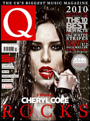
Q is a music magazine aimed at 24-44 males, this is due to the in-depth articles that feature in the magazine, also the artists that feature are the “serious” ones; this is not a magazine that covers the likes of McFly. The target audience would be interested in a wide range of music; they would also be interested in reading thorough articles on these acts.
The single lettered title is prominent on the newsstands, seeing as other magazines have a whole word title, this tells us that the magazine will feature only the acts that ‘stand out’. The ‘Q’ leans slightly to the left; this shows that the magazine not only covers mainstream acts but also the ‘left-field’ acts that don’t usually get coverage in the main news press. Also the shadowing effect connotes how Q’s readership follows them; we trust what we read in the magazine.
From the front cover, we can see by the puffs that the magazine will consist of articles on a range of acts; from Vampire Weekend to 50 Cent. It also consists of features on new artists as the puff reads ‘The 10 Best New Acts’ but also well established artists such as U2 and Biffy Clyro. The buzz word ‘Best’ makes the readership believe that Q magazine will only feature the most prestigious of artists, we also feel that they want us to have the best; they are giving us value for money.
The anchorage text attached to the central image of Cheryl Cole tells the readership that the main feature in the magazine will be on her.
The central image of Cheryl Cole has a direct mode of address; Q wants the reader to feel as if they have a relationship with her, they want the reader to feel attached to the Cheryl and therefore feel as if they have to buy the magazine. Cheryl is on the cover due to the fact that she has recently released her first solo album, she needs to promote her singles and albums for them to be successful. Also as Q is aimed at males, Cheryl Cole makes an attractive draw for readers seeing as she was voted number one in FHM’s top 100 sexiest females in 2009.
The anchorage text attached to her reads “3 Words ... Cheryl Cole, Rocks”, this is an intertextual reference to her album that is titled ‘3 Words’. Also the magazine is trying to detach Cheryl from her pop image; as she is in the girl band Girls Aloud she may not appeal to the readership on their musical credibility. However, by the edgy central image and saying that she ‘rocks’, the readership may start to believe that she has left her pop days behind her.
From the image, we get the idea that Cheryl is conveying the message that she is not only ‘sexy’ but also edgy. The image has an intertextual reference to the film ‘Sin City’, this is a film that Qs readers should be familiar with, and this ensures that the reader will not be alienated by the magazine and by the fact that a pop artist is featuring. The red lipstick connotes sexuality to the readership; this is due to the fact that it is predominantly by males. However, female readers may see the lipstick as connoting power, as we typically attribute this to business types when it’s combined with black clothing. This is also combined with the pointed ring that looks like a claw; for females again this would connote power; however the ring caters for the male readership as she is licking the tip in a seductive way.
From this front cover, females are being represented in a stereotypical way, no matter what magazine a female features on they are always shown in a seductive or attractive manner. This also stereotypes the readership as the magazine is showing us what we stereotypically want to see; males want a sexy image and females want to see someone that we can aspire to.
The Colours of the magazine follow a black, white and red theme; this is due to the reference to Sin City which also follows this theme. Also it ties in directly with Cheryl’s new ‘rock’ image and Q’s prestigious style. The colours and central image creates a dark atmosphere, but also a very ‘cool’ one, the imagery makes the readers aspire to be like Cheryl as she sheds her former image for this photo shoot. The Block title is also in red and white; the background of red connotes power and danger, with its standing out in the music stand and the white demonstrates how it is a prestigious magazine. This is heightened by the fact that the rating Q gives an artist features on their advertising campaign. Also the red and white would appeal to the English readership as they are the colours of their national flag.
The Slogan for the magazine reads ‘The UK’s Biggest Music Magazine’, this shows Q’s self confidence that it is the best magazine for music in the UK. It also gives the readership the sense that everyone will be catered for; if it is the biggest then it has to feature a wide range of artists from various genres, this is something that Q manages to do.
The fonts used on the magazine as simple, blocked ones. This makes the magazine easy to read at first glance, this ensures that they entice a broad readership as the font appeals to everybody.
The magazine attempts to attract the audience by mentioning a wide range of artists in the puffs, the audience are more likely to spot an artist they like in the long list. They also make the audience feel that they will be ahead of everyone else in the music world as they reveal the best acts of 2010, even before the year has fully started.
Subscribe to:
Comments (Atom)